
CSS101: A Beginner's Guide to Styling Websites
From the previous articles, you learned to set up your web development environment, HTML Fundamentals and now you’re ready to start learning CSS. If you haven’t read the articles yet, you can read them at the following links:
- Web Development Environment Setup on Windows 10 or 11: A Beginner's Guide
- HTML Fundamentals: A Comprehensive Guide for Quick and Effective Mastery of Web Development Basics
Before we dive into CSS, it's important to understand the basics of HTML. HTML, or Hypertext Markup Language, is the foundation of the web. It's used to structure content on the web, including text, images, and links. When you create a website, you use HTML to define the content and structure of your pages.
CSS is used to style the content that you've created with HTML. It allows you to control the font, colour, size, and layout of your web pages. By learning CSS, you can make your websites more visually appealing and easier to use.
This guide is designed to give you a solid foundation in CSS, starting with the structure of a CSS file and how to link it to your HTML. From there, we'll cover the different types of selectors available and how to use them to apply styles to your HTML elements. We'll also delve into the concept of the cascade and inheritance, which determine the order in which styles are applied and how styles are passed down from parent to child elements. Finally, we'll touch on some advanced topics like layout, CSS3, and debugging to round out your CSS skillset. Get excited to explore the amazing world of CSS!
Ready to start your CSS adventure? We've got a fun surprise for you! This video will give you a quick and easy overview of CSS in just 100 seconds. Let's have some fun and learn how to style HTML together using CSS! Grab some popcorn and let's get started.
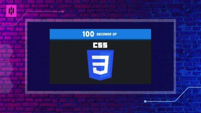
This is a quick and easy introduction to CSS, perfect for those looking to learn the basics in no time. Learn the fundamental concepts of styling and formatting web pages, with 100 concise and actionable tips and tricks to get you up and running with CSS in just 100 seconds.
What is CSS?
CSS stands for Cascading Style Sheets. It is a stylesheet language used to describe the look and formatting of a document written in HTML (HyperText Markup Language). While HTML is used to structure and define the content of a webpage, CSS is used to style and layout the content.
CSS can be used to control the appearance of multiple webpages at once by separating the style from the content. This makes it easy to maintain and update the look of a website
How does CSS work?
CSS works by attaching style rules to HTML elements. A style rule consists of a selector and a declaration block. The selector identifies the HTML element(s) that you want to style, and the declaration block contains one or more declarations that specify the styles you want to apply to the element(s).
CSS rules are used to specify the different elements of a webpage. For example, you can use a rule to specify the font size, color, and background of a heading, or to specify the size and border of an image.
You can also use classes and ids to style specific elements. Classes and ids are used to identify elements that share the same styling. For example, you can use a class to style all the headings on a page, or an id to style a specific element.
Finally, you can use CSS to create custom styles. This includes styling elements with colors, fonts, backgrounds, and more. You can also create your own custom classes and ids to easily apply styles to multiple elements.
Here's an example of a style rule in CSS:
p {
  color: red;
	font-size: 16px;
	font-family: Arial, sans-serif;
}
In this example, the p is the selector and the declaration block consists of three declarations that specify the text color, font size, and font family for all p elements on the webpage.
The declarations in a declaration block are separated by a semicolon (;). Each declaration consists of a property and a value, separated by a colon (:). The property is the style attribute that you want to change, and the value is the new value that you want to apply to the attribute.
How to Apply CSS to a webpage
There are three ways to apply CSS to a webpage:
- Inline styles: Inline styles are applied directly to the HTML element using the style attribute. They only apply to the specific element that they are added to, and take precedence over any other style rules that may apply to that element.
Here's an example of an inline style:
<p style="color: red; font-size: 16px; font-family; Arial, sans-serif,">This is a paragraph with inline styles</p>
- Internal styles: Internal styles are defined in the < style> element in the < head> of the HTML document. They apply to the entire document, and take precedence over external styles.
Here's an example of internal styles:
<head>
<style>
		p {
			color: red;
			font-size: 16px;
			font-family: Arial, sans-serif;
		}
</style>
</head>
- External styles: External styles are defined in a separate CSS file, which is linked to the HTML document using the < link> element in the < head> of the HTML document. External styles apply to the entire document, and take precedence over internal styles.
Here's an example of how to link to an external stylesheet:
<head>
	<link rel="stylesheet" href="/path/to/styles.css">
</head>
CSS Frameworks
CSS frameworks are pre-prepared libraries that are meant to allow for easier, more standards-compliant styling of web pages using the Cascading Style Sheets language. In other words, they are a collection of CSS, JavaScript and other files that are designed to help you create consistent and well-designed websites quickly and efficiently. They usually provide a basic grid system, pre-designed UI elements such as forms, buttons, and typography, and a set of CSS classes that you can use to style your HTML elements.
There are many popular CSS frameworks available, such as:
- Bootstrap: One of the most popular and widely used CSS frameworks. It is a responsive framework that provides a grid system and pre-designed UI elements.
- Foundation: Another popular responsive framework that provides a grid system and pre-designed UI elements.
- Bulma: A lightweight, responsive and mobile-first framework that focuses on simplicity.
- Tailwind: A utility-first CSS framework that provides low-level utility classes that can be composed to build complex designs.
- Materialize: A framework that provides Material Design guidelines and elements.
- Semantic UI : A Framework that provides predefined CSS classes for HTML elements following semantic best practices.
These frameworks can save a lot of time, as they provide a solid foundation for building a website and take care of many common styling tasks, allowing you to focus on other aspects of the development process such as content and functionality.
Most of the frameworks also provide a responsive design by default, meaning that the layout and elements will adjust to different screen sizes and resolutions. This is important since it's a way to make sure your website is accessible on any device.
However, it's important to note that using a CSS framework does not mean that you can't add your own custom styles. Most frameworks provide ways to customize the look and feel of the website. For example, by using variables, custom classes, and overrides.
Additionally, many frameworks also provide JavaScript plugins to add functionalities, such as modals, accordions, and carousels.
Basic CSS topics
Here are some basic concepts of CSS and examples of how to use them:
Box Model
The CSS box model is the foundation of all layout in CSS. It defines a rectangular box for each HTML element, with content, padding, borders, and margins.
Here's an example of how you can use the box model to adjust the size of an element:
.box {
	width: 300px;
	padding: 20px;
	border: 2px solid black;
	margin: 20px;
}
In this example, the box will have a width of 300px and a content area that is 260px wide (300px - 2 * 20px padding). The element will also have a black 2px border, and a 20px margin around it.
Display
The display property is used to specify the type of box an element should generate. The most common values are block, inline, and inline-block.
Here's an example of how you can use the display property to change the display of an element:
.block {
	display: block;
}
.inline {
	display: inline;
}
.inline-block {
	display: inline-block;
}
In this example, the block class makes the element generates a block box, the inline class generates an inline box and the inline-block generates a box that behaves like an inline box but it also respect width and height properties.
Position
The position property is used to specify the position of an element. The most common values are static, relative, absolute, and fixed.
Here's an example of how you can use the position property to position an element:
.absolute {
	position: absolute;
	top: 10px;
	right: 20px;
}
In this example, the element with the class "absolute" will be positioned 10px from the top and 20px from the right of its containing block.
Text Properties
CSS provides several properties to control the layout of text within elements.
Here's an example of how you can use text properties to format text:
.text-format {
	font-size: 20px;
	font-weight: bold;
	text-align: center;
	text-transform: uppercase;
}
In this example, the element with the class "text-format" will have a font size of 20px, bold font-weight, center-aligned text and all the letters will be uppercase.
Background Properties
CSS provides several properties to control the background of elements.
Here's an example of how you can use background properties to control the background of an element:
.background-color {
	background-color: green;
	background-image: url("your-image-url");
	background-repeat: repeat-x;
}
In this example, the element with the class "background-color" will have a green background and an image repeating horizontally, also the url must point to a valid image resource.
Advanced CSS topics
Now that you have a basic understanding of how CSS works, you can start exploring more advanced topics to enhance your skills and add more functionality to your websites. Here are a few areas to look into:
CSS Layouts
CSS provides several layout modules that allow you to control the layout of your web pages. These include the CSS Box Model, Flexbox, Grid, and CSS Grid Layout.
The CSS Box Model is the foundation of all layout in CSS, it defines a rectangular box for each HTML element, with content, padding, borders, and margins. Understanding how the box model works is essential for creating consistent and predictable layout in your web pages.
Flexbox and Grid are more recent layout modules that allow for more powerful and flexible layout options, perfect to create responsive design, where the website adapts to different screen sizes.
Here is an example of a basic 2-column layout using the CSS Grid Layout module:
.container {
	display: grid;
	grid-template-columns: 1fr 1fr;
}
.left-column {
	grid-column: 1;
}
.right-column {
	grid-column: 2;
}
This CSS code creates a container class that uses the grid layout, with two equal-width columns (1fr stands for 1 fraction unit). The left-column and right-column classes are used to specify which column the content should be placed in.
Here is an example of how Flexbox layout can be used to create a flexible navigation bar:
.navbar {
	display: flex;
	justify-content: space-between;
}
.navbar a {
	flex: 1;
}
This CSS code creates a navbar class that uses flexbox layout, aligning the links (a) within the container using space-between property. Also the flex property set to 1 means that all the links will take equal space
CSS Selectors and Specificity
CSS selectors are used to select elements on the web page to apply styles to. Understanding the different types of selectors available, such as class selectors, id selectors, attribute selectors, and more, and how to use them effectively will help you to create efficient and maintainable stylesheets.
Specificity is the order of precedence of the styles, when multiple styles are applied to the same element, CSS uses a set of rules to determine which style should take precedence. Understanding specificity is essential to avoid unexpected results when working with CSS.
Here is an example of a CSS rule that uses a class selector:
.red-text {
	color: red;
}
In this example, the rule is selecting all elements with the class "red-text" and setting their color to red.
And here is an example of a CSS rule that uses an ID selector:
#header {
	background-color: blue;
}
This rule is selecting the element with the ID "header" and setting its background color to blue.
When it comes to specificity, here are two examples:
#header {
	background-color: blue;
}

.red-text {
	color: red;
}
In this case, the rule with the ID selector (#header) has higher specificity than the class selector (.red-text), thus the text color inside #header will be blue, because the background color rule takes precedence.
.container .red-text {
	color: red;
}
.red-text {
	color: blue;
}
In this case, the first rule (".container .red-text") has a higher specificity than the second rule (".red-text") because it is more specific. So, all the elements with class "red-text" inside of elements with class "container" will be red, the others will be blue.
CSS Transitions and Animations
CSS Transitions and Animations allow you to add dynamic effects to your web pages, such as smooth changes in size, color, and position, without the need for JavaScript. These tools can be used to create simple hover effects, complex animations, and more.
Here is an example of a CSS transition that changes the width of an element on hover:
.box {
	width: 100px;
	transition: width 0.5s;
}

.box:hover {
	width: 200px;
}
And here is an example of a CSS animation:
@keyframes slidein {
	from {
		transform: translateX(-100%);
	}
	to {
		transform: translateX(0);
	}
}

.box {
	animation: slidein 2s;
}
This animation slides an element from off the screen (translateX(-100%)) to its original position (translateX(0)) over a period of 2 seconds.
CSS Preprocessors
CSS Preprocessors are scripting languages that extend the capabilities of CSS, such as variables, functions, and mixins. They allow you to write more efficient and maintainable CSS code. The most popular preprocessors are SASS, LESS, and STYLUS.
Here is an example of how variables can be used in SASS:
$primary-color: blue;
$secondary-color: green;

.container {
	background-color: $primary-color;
}

.box {
	color: $secondary-color;
}
In this example, the primary-color and secondary-color variables are defined at the top and are then used to set the background color of the container and the color of the box respectively.
Responsive Web Design
Responsive Web Design (RWD) is an approach to web design that makes web pages adjust their layout and content to different screen sizes and resolutions. This is essential in today's world, where users access the internet from a variety of devices, including desktop computers, laptops, tablets, and smartphones. With RWD, you can create web pages that look and work great on any device.
Here is an example of how media queries can be used to change the layout of a website based on the screen size:
/* Default styles */
.container {
	display: flex;
	flex-wrap: wrap;
}

.box {
	flex: 1;
	height: 200px;
}

/* Media query styles */
@media only screen and (max-width: 600px) {
	.container {
		flex-wrap: nowrap;
	}
	.box {
		flex: 1 1 100%;
	}
}
In this example, the default styles are for a flex container with flex-wrap set to "wrap" and the boxes within the container with flex set to 1. The media query applies when the screen size is 600px or less and changes the flex-wrap property of the container to "nowrap" and the flex property of the boxes to "1 1 100%" which makes the boxes take the full width of the container.
These are just a few examples of the many things you can do with CSS. Please note, that all these examples are a simplification of real-life usage, it's important to test and debug your code to ensure that it works correctly on all target devices and browsers.
Common Mistakes in Learning CSS
Learning CSS can be challenging, especially for beginners. Here are some common mistakes that people make when learning CSS, and tips on how to avoid them:
- Not understanding the box model. The box model is the foundation of all layout in CSS and understanding how it works is essential for creating consistent and predictable layout. Make sure you understand the difference between the width, padding, and margin properties, and how they affect the size of an element
- Not understanding the display property. The display property is used to specify the type of box an element should generate. Make sure you understand the difference between block, inline, and inline-block, and when to use each one.
- Not understanding the position property. The position property is used to specify the position of an element. Make sure you understand the difference between static, relative, absolute, and fixed, and when to use each one.
- Not understanding the cascading nature of CSS. CSS stands for Cascading Style Sheets, and it is called so because styles cascade down from parent elements to child elements. Make sure you understand how CSS selectors work, and how to use them effectively to target the right elements
- Not understanding the importance of CSS specificity. When multiple styles are applied to the same element, CSS uses a set of rules to determine which style should take precedence. Make sure you understand how specificity works and how to avoid unexpected results
- Not understanding media queries. Responsive web design is an approach to web design that makes web pages adjust their layout and content to different screen sizes and resolutions. Media Queries are key to achieving this, make sure you understand how to use them and how to create different styles based on the screen size
- Not using CSS preprocessors. CSS preprocessors are scripting languages that extend the capabilities of CSS, such as variables, functions, and mixins. They can help you to write more efficient and maintainable CSS code
- Not testing your code. CSS works differently on different browsers and devices, make sure you test your code on different platforms and devices to ensure that it works correctly and it's compatible with the devices of your target audience
Recommended CSS Books for Beginners
I've got some great book suggestions for you! These books are perfect for beginners and will give you a solid understanding of CSS in a clear and straightforward way. With plenty of examples and exercises, you'll be able to grasp the concepts with ease.
- CSS: The Definitive Guide by Eric A. Meyer
- HTML and CSS: Design and Build Websites by Jon Duckett
- HTML and CSS: Visual QuickStart Guide by Elizabeth Castro
- Speaking in Styles: Fundamentals of CSS for Web Designers by Jason Cranford Teague
- CSS Secrets: Better Solutions to Everyday Web Design Problems by Lea Verou
- CSS3: The Missing Manual by David Sawyer McFarland
- Learning Web Design: A Beginner’s Guide to HTML, CSS, JavaScript, and Web Graphics by Jennifer Niederst Robbins
- Responsive Web Design with HTML5 and CSS3 by Ben Frain.
Free CSS Video Tutorials for Beginners
Here, I have gathered a list of 10 Best Free Courses on CSS that will guide you from a beginner to a CSS pro. I have taken care to eliminate any confusion in selecting the right course for you. You can choose based on the level and scope of CSS knowledge you desire to attain. Enjoy watching!
- CSS Tutorial - Zero to Hero (Complete Course)
- CSS Tutorial In Hindi (With Notes)
- CSS Crash Course for Absolute Beginners - Full Course
- CSS Tutorial – Full Course for Beginners
- CSS Tutorial for Beginners: Learn CSS in 1 Hour
- CSS Crash Course - Tutorial for Complete Beginners
- CSS Crash Course For Absolute Beginners
- CSS Flexbox Tutorial for Beginners | Basics & Container
- CSS Crash Course | Learn CSS in 30 Minutes
- CSS Full Course - Includes Flexbox and CSS Grid Tutorials
Conclusion
In conclusion, CSS is a powerful styling language that is used to create visually appealing and consistent websites. To master CSS, it is important to understand the basics of HTML, the box model, the display property, and the position property. Understanding CSS selectors and specificity is also crucial for targeting the right elements with your styles. Practice and experimentation are essential to mastering CSS, and CSS preprocessors and frameworks such as Tailwind, Bootstrap and many more that can help you to write more efficient and maintainable code. It's important to test your code on different platforms and devices to ensure it works correctly and is compatible with the devices of your target audience.
In summary, to become an expert in CSS it's crucial to start with the fundamentals and gradually build on it, understand the cascading nature and specificity of the language, practice and experiment using different styles and techniques. Utilizing tools such as code editor, CSS preprocessors, CSS Frameworks and testing your code on various devices and browsers, will make your CSS development process more efficient and allow you to create visually stunning websites. With time and dedication, you'll be able to master this powerful tool and create visually appealing websites that are compatible with a wide range of devices and browsers.